
MMA Launches New Website
Morehouse MacDonald and Associates, Inc., is proud to introduce its brand new company website. Internally conceived, the new site was designed and developed by the award-winning international WordPress agency Crowd Favorite. Carefully crafted and custom coded, the new MMA website delivers bold enlarged stunning imagery and powerful Social Web publishing capacity across all Internet devices, from your iPhone to your super large computer screen. On a 27-inch Apple iMac, for instance, the website delivers rich color and black & white 2K photography, while an internal engine smartly downsizes imagery for mobile viewing to popular iPad and smartphone devices.
Materials and Detail Matter
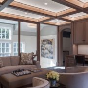
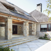
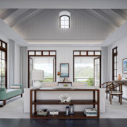
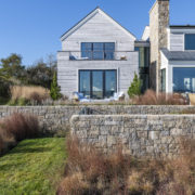
Our distinguished body of work is the type of architecture that must be experienced in order to truly be appreciated—not just in the varied spatial conditions presented to the occupants—but equally important in the richness of materials and the high-calibre craftsmanship consistently delivered in all our projects.

The new website helps visitors get much closer to the work. It is now possible to see details like wood grain and textures, and rich fabrics and textiles, on walls and furniture pieces that previously were not easily discernible. MMA takes great pride in its ability to thoughtfully execute delightful and personalized touches in its architecture, especially where the client is close to the experience of a building.
A Mobile Reality
Our new website fully accounts for the fact that a greater percentage of web viewing is happening on smartphones and tablet computers. Nearly 20 percent of all visitors to the MMA site are viewing it on such mobile devices. A full dynamic ‘responsive’ web site design delivers all content appropriately scaled to both tablet computers of all sizes and smartphones. It is especially enjoyable to peruse the new MMA website on a tablet device, like Kindle or iPad, in vertical portrait mode.

MMA’s new website was beautifully conceived to work optimally on popular tablet computers, especially in portrait ‘reading mode.’
Whether in portrait or landscape mode makes no difference, our new website will adapt and present a diversity of layouts on all mobile devices based on screen resolution size, keeping navigation accessible and scaled to a touch-screen interface. Primary animated behaviors delivered on the desktop are also delivered to mobile devices.
New Blog: Plus, We’ve Gone Social!
The new website will help keep our wonderful clients, collaborators, and industry press ‘up-to-date’ on MMA’s latest activities. The News page is a new Social-powered blog and site visitors are encouraged to share and ‘Like’ our posts. From the Work portfolio section site visitors can both Tweet and Like posts and share on their social media walls.
MMA has gone totally social on the web, adding to existing Houzz and Facebook pages with a new Twitter account, so users of Twitter can keep track of all MMA announcements. And MMA won’t just be shouting out about ourselves. Our partners do amazing work, with us and with others, and we are very proud of their talents and our association with them. We will be keeping an eye out for their noteworthy efforts and shining a well-deserved light on them.
We hope you enjoy looking at our body of work on our new MMA website as much as we do.


 Eileen Shields joined MMA in 1989 as Office Manager. During her more than 25 years with MMA, her position has evolved along with the growth of the firm. In addition to general office management, Eileen’s responsibilities also include bookkeeping, billing, accounts receivable, accounts payable, payroll, insurance, and human resource management.
 Kyle McCreight Carroll is a talented project designer who graduated with a Bachelor of Science in Environmental Studies from Oberlin College and received her Master of Architecture from Miami University.


 James Christopherson joined MMA in 2000 and brings diverse experiences in design and building construction expertise spanning more than 25 years. Among those are several years in the design of large-scale medical facilities, assisted care communities, and nursing homes. James has also practiced for several years as an independent architectural designer and visual communications consultant. He has designed private residences, condominiums, banks, libraries, and office buildings; additionally, he has produced major illustrations for many of the Boston areas’ most respected architecture firms.
 John S. MacDonald, AIA, is principal and owner of Morehouse MacDonald and Associates, Inc. and has served in that capacity since 1988, directing the firm’s growth and management. John serves as Principal-in-Charge of each project and is responsible for setting overall design direction within the firm. His designs have appeared in numerous design and professional magazines such as Architectural Digest, Metropolitan Home, Better Homes & Gardens, House Beautiful, Boston Common, Cape Cod & Islands Home Magazine, Boston Magazine and Trends Magazine. In addition, John has appeared on the cable television channel HGTV discussing the firm’s architectural work and showcasing several key projects.

 Elizabeth Cameron joined Morehouse MacDonald and Associates as an interior designer in 2017, to help us with interior design projects in the Lesser Antilles. The Oklahoma native moved to Boston in 2012 to pursue a degree in Architectural Studies with a minor in Visual Arts from Boston University which she received in January of 2016. She also studied European architectural history in Venice during her education at Boston University. Elizabeth earned her Masters of Arts degree in Interior Architecture at Suffolk University in 2018.
 Anthony M. Frausto-Robledo, AIA, LEED AP, has been with MMA since 1999. In 2018 he was promoted to associate principal and in 2025 to principal and partner.

 Duncan Morton joined the MMA team as a Project Architect. He received a Bachelor’s degree in Mathematics from Bates College and a Master’s in Education from Boston College.